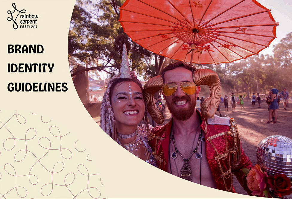
REDESIGNING A FESTIVAL
Redesigning Rainbow Serpent Festival, which is a four day annual event in Lexton, Victoria. They are in need of a visual identity design for the festival. The festival is a huge success in Victoria, but their focus on cohesive branding is lacking. While looking at their brand, it seems like it's been done by themselves just to keep the audience updated, rather than targetting their audience.

BRIEF AND OVERVIEW
I designed various communications items for the festival in a brand guidelines document, demonstrating a unified and cohesive personality and essence of the festival.
The festival is an open air music and arts festival, not just a regular festival, but one of the most successful in Australia for which people come from all around the world. It comes from Indigenous Australians dreamtime creation myth and share the explosion of colors and creativity.
Their main values are to, Create, Connect and Grow.
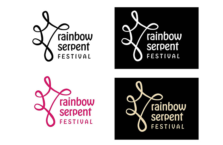
LOGO USAGE
I have created an organic shape logo on Adobe Illustrator. As the festival is for dancing and people finding themselves, I found a loose organic shape somewhat representing dance along with typography shows the new feel for the brand.
Their main logo is to be used across various brand applications. Along with that, the two coloured logo are used using the Pantone system.
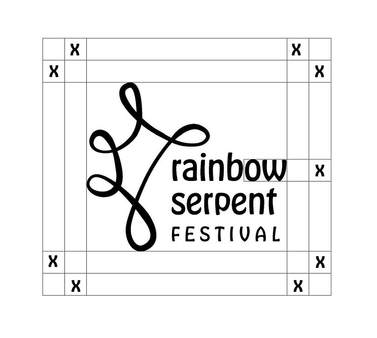
LOGO CLEAR SPACE
To keep the legibility of the logo, a minimum clear space is defined using the height of "O". This minimum space should be maintained throughout the brand applications.
NEW BRAND VOICE
Colour Palette
Colours have been chosen keeping in mind to convey certain feeling to the target audience. The pink, yellow, orange and off white represents their main values of energy, friendliness, and the connections. As this festival is held during summers in Australia, the colours are also inspired by that.

Brand Imagery
I edited the photos to look similar. It represents the visuals for brand personality, so I have specifically chose the ones which shows art, fun time, adventure and togetherness.

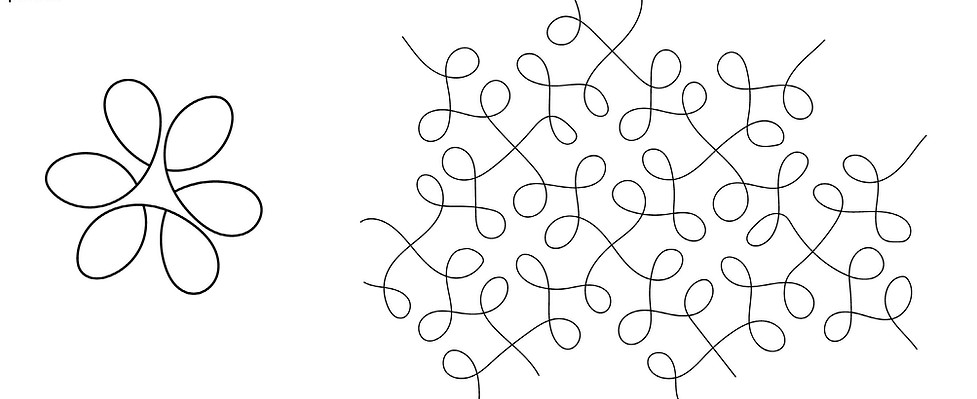
Pattern
Organic, loose, dance form, music and connection to nature and each other are kept in mind while designing the patterns.
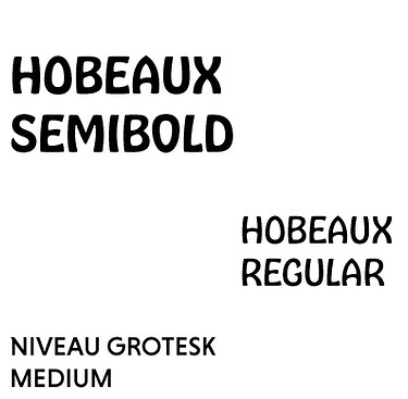
Typography
Typography to show organic and friendly feel to the festival. Their current typography is not consistent through the use. So, I have created typefaces to be used consistently.

Website and Mobile
Their current website is all over the place with various colours, different typefaces, and not so friendly. I have created one using the consistent patters, colours and type.

Adjusted the size of website to be mobile friendly.

Mock-ups


