PRODUCT DESIGN
I created a brand voice and product for "byjango", a fictitious perfume company launching in Australia. As a designer I created all the company launching visualisations including product mockup, product voice, target audience, mockups, logo design, colour and typography.
OVERVIEW
It is a company with 6 different frangrances. We worked in groups to decide a brand story and concept for the company. We brainstormed various ideas for the brand story and direction.
CONCEPT DEVELOPMENT
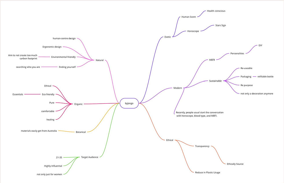
We decided to go with creating a human scent, personalised to you. People use ways like horoscope, mbti personality test and blood type to understand themselves better. By this perfume, we aim to help people find themselves and give a smell of calmness in their lives. This is for young, health conscious, ethical and trendy audience between the age of 21-35.
While things like skin tones and body type is useful in helping make purchase decision in skincare and fashion industry. Byjango uses a similar concept by creating a personalised perfume.
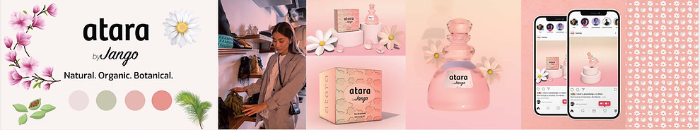
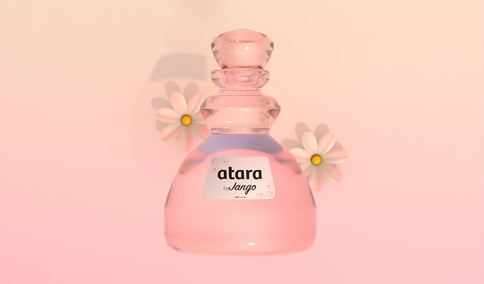
My chosen scent in this group project is ATARA, made up of Mangolia, Chamomile, Cedar, and Cardamom. All the product development of ATARA is done individually by me.
PRODUCT DEVELOPMENT

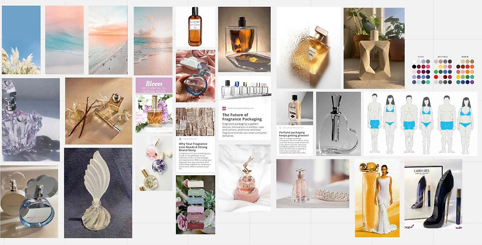
ATARA's stylescape of early development. I have been inspired by creating a scent for neutral skin tone, which is relevant for all skin types and tones.
It is a gender neutral perfume, so my main hues are Pink and Green for the brand personality. While traditionally pink is a feminine colour, having green to balance out the feminine touch from Atara. Additionally, I kept in mind the colours of the ingredients, like green for cardamom.

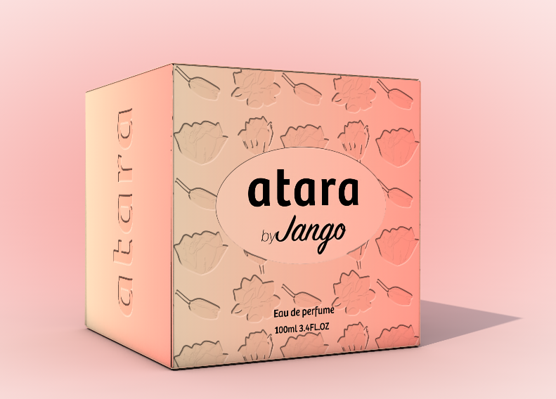
LABEL AND PACKAGING DESIGN
Staying consistent with the floral theme for the label design.
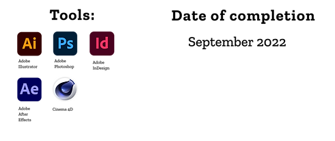
For packaging design I have been inspired to have an embossed label on the packet. This effect was created on Photoshop and Illustrator and exported to a 4D package.


BOTTLE DESIGN
My aim with the bottle design is to create a shape which aligns with the concept of skin tones and body types. My bottle represents an hourglass body shape. Since the target audience is someone who is sustainable and cares about the environment. Organic shape is something they would get attracted to.

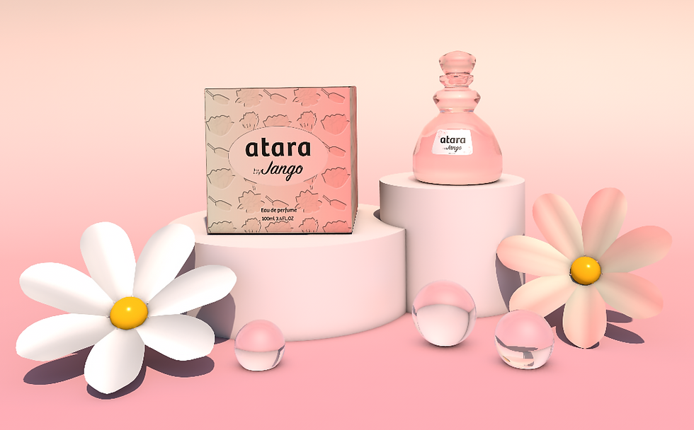
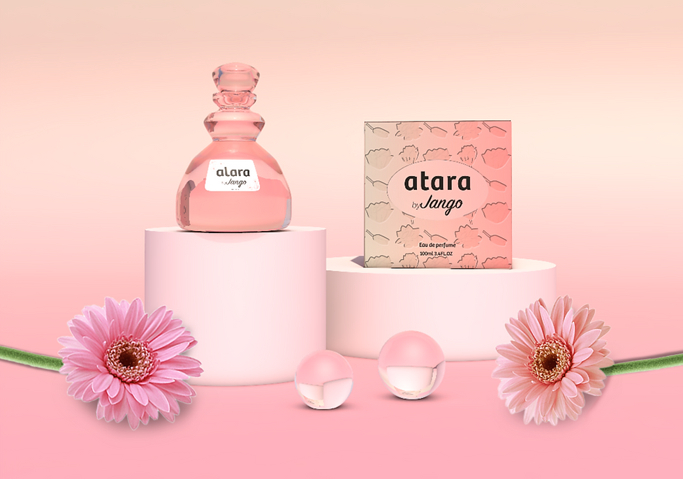
4D PACKAGING DESIGN
VISUALISATIONS

ANIMATION VIDEO