BRAND IDENTITY
An Australian based fictitious restaurant brand identity. I incorporated the traditional culture of Punjab, India in a modernised way. It aims to share the Punjabi culture with the community.

BRIEF
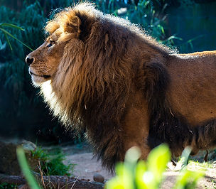
This started with a picture of an actual animal, Lion. The brief stated to create a visual identity for an animal and I was provide with an image of the animal. I started my research with the words I associate with the Lion before coming up with Singh Diner.
_tiff.png)
_tiff.png)

OVERVIEW
From the practice of word associations, I realised "Singh" means Lion in Punjab, India. People from Punjab are known for their food, so I'm inspired to create a fine dine in to share this culture and traditional food.
I defined a Target audience and why for my brand.

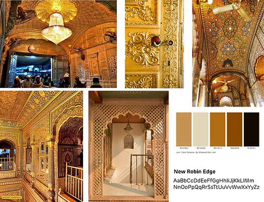
MOODBOARD AND RESEARCH
My moodpboard is inspired by the architecture of Punjab. The color tone it associates are warm too, which goes well with the Lion and the fine dine restaurant I inspire to create.
While Lion appears to be bold, powerful and rage, Singh diner is bold but friendly. I decided to go with a Serif font to show it is inviting and friendly while providing a sophisticated experience.


FINAL DESIGN
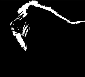
Logo
_tiff.png)
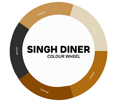
Colour Palette
_tiff.png)
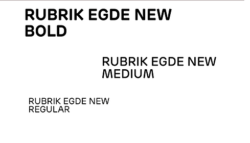
Typeface
_tiff.png)
Typography
_tiff.png)
The pattern to be used in the brand design is inspired by the shapes and architecture of the Punjabi culture.
Pattern

Mock-ups